At Recast I have the privilege and challenge of introducing advanced statistical concepts to people who have a strong desire to be more data driven, but who do not have much of a background in formal statistics.
While word has gotten out that “statistical significance” isn’t all it’s cracked up to be, and best practices on how to run valid A/B tests have started to spread, there’s one persistent statistical misconception that continues to haunt my conversations with statisticians and non-statisticians alike: R-Squared (sometimes written R^2).
Most people who still remember anything from their college statistics class can tell you that the R-squared metric, also known as R^2 or the ‘coefficient of determination’, tells you “what percentage of your dependent variable is explained by the model”. They believe that higher R-squared is better, and think about it like a scoring system:
- R-squared greater than 0.9 is an A
- R-squared above 0.8 is a B
- R-squared less than 0.7 is a fail
The truth is the common intuition around R-squared is seriously faulty. Here’s my thesis: the concept of “R-squared” is generally useless and we should banish it from all introductory statistical materials.
R-Squared Meaning
R-squared is used as a measure of fit, or accuracy of the model, but what it actually tells you is about variance. If the dependent variable(s) vary up and down in sync with the independent variable (what you’re trying to predict), you’ll have a high R-squared, as demonstrated in these charts (link to spreadsheet):
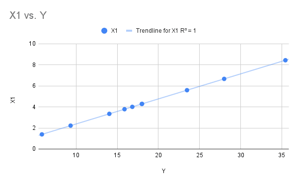
R-squared = 1 in this scenario, where we can see all of the X1 values fall directly on the trendline.
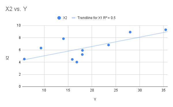
In this more likely scenario, some of the values are quite close to the trendline, while some are further away. To make this X2 column I took the real relationship between X1 and Y, and just added some random noise, so that many of the values fall away from the line.
Being far away from the trendline is an ‘error’ in model terms, for example when X2 was 8, the model would have predicted a Y of 30: in actuality it got a value of around 14 (trace with your eyes across from the value to where the line sits on the Y axis, versus where it would have been if that value was on the line). Some errors are bigger than others, but all in the X2 variable explains about 50% (R-squared = 0.5) of the variance in Y.
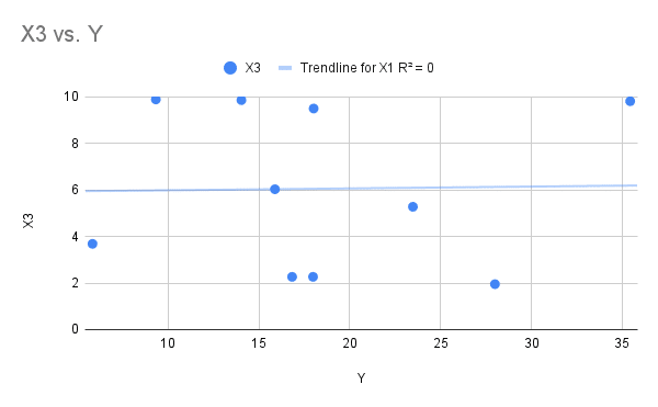
Now let’s look at the extreme case: where R-squared equals zero. You don’t need a degree in statistics to see something looks wrong here. The trendline only captures one of the dots: they look randomly distributed across the chart. It looks like there isn’t really a model here and you’d be right: this data was randomly generated, and there is no relationship between X3 and Y.
Now we have some intuition for how R-squared works, we can see why it became popular as a measure of accuracy. Because it commonly is calculated for you when you use Excel or a statistics package, it’s a convenient metric to glance at to sense-check where you’re at.
To be honest it’s fine to look at R-squared as one of the diagnostic metrics you use to check how your model is doing. If you have a low R-squared that could be an early warning that triggers further thinking about your model’s assumptions, so you can understand where and why it’s getting things wrong.
All things being equal, more dots on the line is a good thing: it means the model got it right more often. The problem is that all things are never equal!
As one disbelieving student discovered from a ranting statistics professor, R-squared can’t actually be used to compare ‘goodness of fit’ or prediction accuracy across different models.
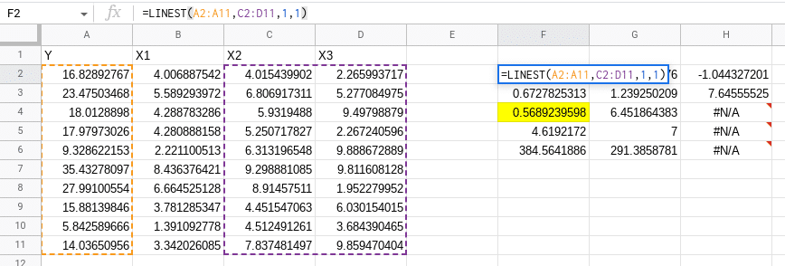
For example if we look at our data and build a model that predicts Y using both X2 and X3 (which we know has no relationship with Y – it’s randomly generated data), our R-squared actually increases from 0.5 to 0.568! Adding another variable, even one that contained no information, increased our R-squared, tricking us into thinking we improved our model.
I’ve seen more presentations than I can count on a statistical model where the analyst leads with the R-squared of the model to build credibility: “This model has an r-squared of 0.97 so you know it’s good” they imply, even if they don’t state it explicitly.
This metric is pernicious because it does not measure what people actually care about (is the model good?). In fact, in my experience high R-squared is regularly correlated with having a worse model.
As we’ve seen, R-squared is trivially easy to increase by including more variables in the model (even the “adjusted R-squared metric” is going to suffer from this problem). Including additional variables in the model will drive up R-squared but will actually (generally) lead to worse inferences, and often results in models that are “over fit” and therefore don’t predict well either! Let’s look at a few real-world examples to illustrate this further.
Example 1: Adding Variables
Let’s imagine we want to build a model of inseam length (the length of your suit trouser leg) in humans. We have a dataset of:
- Left leg length
- Right leg length
- Height
- Weight
We might start by saying that we can specify a model like:
![\[left\_leg\_length = \beta_0 + \beta_1*height + \beta_2*weight\]](https://getrecast.com/wp-content/ql-cache/quicklatex.com-d101f4a8ccaa15f72df17b024b1b2a46_l3.png "Rendered by QuickLaTeX.com")
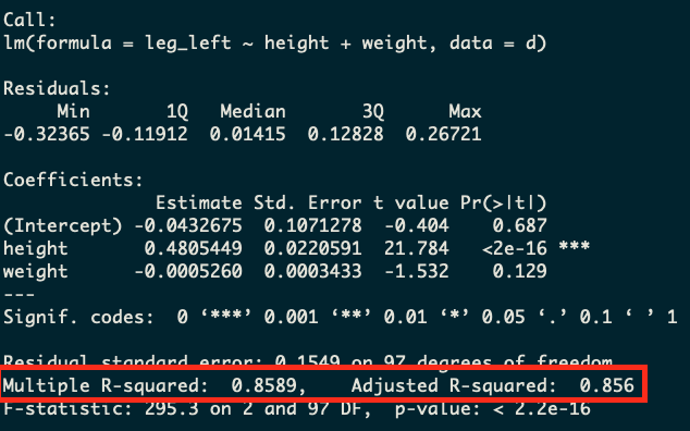
Seems like a reasonable model! It’ll tell us how leg length is related to height and weight in the population. Using the data below, we get an R-squared of 0.86 with a model like this on real data. However, we surely haven’t maximized R-squared yet. We’ve got a whole other variable to include. So now let’s check out our alternative model:
![\[left\_leg\_length = \beta_0 + \beta_1*height + \beta_2*weight + \beta_3*right\_leg\_length\]](https://getrecast.com/wp-content/ql-cache/quicklatex.com-699c6f8cfd7dde9bbc8e99bd5e8db82b_l3.png "Rendered by QuickLaTeX.com")
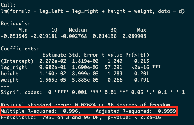
Well now we’ve got a model that is going to knock it out the park on the R-squared metric. We’re going to be able to explain 99.6% of the variation in left-leg-length with this model. Isn’t that great?
Well, not really. If we take a step back and think about what’s going on with this model we’ll realize that this probably is a nonsensical model! If we already have right-leg-length, why are we predicting left-leg-length at all? In the vast majority of people these lengths are going to be almost identical. So we’ve gotten a huge R-squared number, but have made a stupid model!
At Recast, we see this a lot when people want to build a model of marketing spend impact on revenue, and they control for traffic. If you control for traffic, you’re going to get a high R-squared but you’re going to have a bad model since traffic is an outcome variable, not an input variable!
Here’s the example code (in R) that you can use to recreate this:
n <- 100
set.seed(808)
d <-
  tibble(height   = rnorm(n, mean = 5.5, sd = 0.75),
         leg_prop = runif(n, min = 0.4, max = 0.5),
         weight_prop = runif(n, min = 1.7, max = 4)
         ) %>%
  mutate(weight = weight_prop * height*12,
         leg_left  = leg_prop * height + rnorm(n, mean = 0, sd = 0.02),
         leg_right = leg_prop * height + rnorm(n, mean = 0, sd = 0.02))

mod <- lm(leg_left ~ height + weight, d)
summary(mod)

mod2 <- lm(leg_left ~ leg_right + height + weight, d)
summary(mod2)
Example 2: Removing data
Here’s another classic example: we can reduce R-squared by reducing the data we have. It should be pretty obvious that more data makes a better model — if you have more observations, you should be able to get more signal out of the model. However, it turns out that if we reduce our data, we can actually get a higher R-squared. Let’s imagine we’ve got data on our site traffic and marketing spend going back for the last year (see example below for simulated data).
We can build three different models at different levels of granularity: one daily, one weekly, one monthly and one quarterly. This’ll be the exact same model specification, but we’ll just aggregate the data to different levels before we run the regression model.
What we’ll see is that the daily model (which has the most data) will have the worst R-squared metric and the nonsensical quarterly model with just four rows will have the best R-squared. This is because R-squared in this case is simply a measure of the variability in the dependent variable. If there’s less variation, there is less to explain, and therefore R-squared will go up. In this case, the model with only two rows is obviously the worst model, but yet R-squared tells us it’s the best!
Daily Model
Monthly Model
Quarterly Model
We’ll note that the adjusted R-squared actually does do a good job here of picking up that the model with less data is worse, although it’s still an unreliable metric since as we saw in the example above the adjusted R-squared can still fool us into making a bad model.
Here’s the example R code you can use to re-create this example:
set.seed(808)
n <- 359
d <-
tibble(day = seq(1,n),
month= ceiling(day/30),
quarter= ceiling(day/90),
channel_1 = pmax(rnorm(n, mean = 1000, sd = 100), 0),
channel_2 = pmax(rnorm(n, mean = 1000, sd = 100), 0),
channel_3 = pmax(rnorm(n, mean = 1000, sd = 100), 0),
noise = pmax(runif(n, min = 100, max=500))
) %>%
mutate(sales = 5000 + channel_1*1.5 + channel_2*3 + channel_3*0.5 + noise)
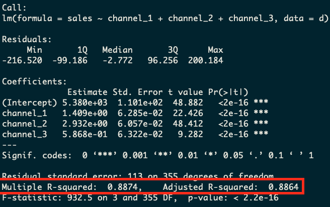
mod1 <- lm(sales ~ channel_1 + channel_2 + channel_3, d)
summary(mod1)
d_month <- d %>%
select(month, channel_1, channel_2, channel_3, sales) %>%
group_by(month) %>%
summarize_all(sum)
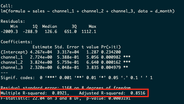
mod2 <- lm(sales ~ channel_1 + channel_2 + channel_3, d_month)
summary(mod2)
d_quarter <- d %>%
select(quarter, channel_1, channel_2, channel_3, sales) %>%
group_by(quarter) %>%
summarize_all(sum)
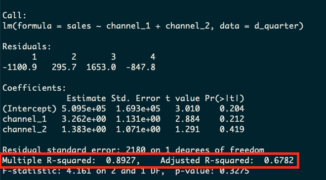
# This model has r-squared of 1 but not enough degrees of freedom
mod3 <- lm(sales ~ channel_1 + channel_2 + channel_3, d_quarter)
summary(mod3)
# So we drop a variable and still have an R-squared that beats our other two models!
mod3alt <- lm(sales ~ channel_1 + channel_2, d_quarter)
summary(mod3alt)Alternatives to R-Squared
The misuse of R-squared as an accuracy metric is usually paired with what Richard McElreath calls “Causal Salad”: trying lots of different variables in your model until it fits the data really well, with no underlying understanding or opinion on why the X variables you used cause your Y variable to increase or decrease.
At Recast we’re big believers in a science-first approach. The model can’t tell you how the world works, only science can do that. What the model can do for you is to tell you what’s likely to be true, given the assumptions you made about the way the world works (derived from scientific experiments) are true. To understand what variables should go in your model, you have to build domain expertise and run experiments to validate your hypotheses, and only then baking them into your modeling assumptions.
However once you have a reasonable grasp of reality, and a sensible model that maps to it, you still need to check to make sure how well it works. Since most modeling exercises in marketing are about telling the future – for example predicting the impact of various marketing budget levels or allocations – the ability of the model to accurately predict the future is important. For this task we use out of sample MAPE (Mean Absolute Percentage Error, the same as used by Google’s LightweightMMM), which tells you as a percentage how “wrong” you were when predicting data the model hasn’t seen yet (from a holdout period).
There are other good measures like NRMSE (Normalized Root Mean Square Error, as used by Meta Robyn) and SMAPE (Symmetric Mean Absolute Percentage Error, as used by Uber’s Orbit). The important thing is not the metric per se, but the key phrase “out of sample”. You always want to be calculating error on data the model hasn’t seen yet. That’s the only true test that will protect against your model overfitting on the past, and it (mostly) protects you from the “adding more variables always improves fit” problem.
Conclusion
R-squared is an extremely misleading metric. It is a measure of how little variation there is in the dependent variable and it encourages analysts to ignore the interpretation of the model at the expense of simply including more variables just to drive up the R-squared vanity metric. Use out of sample MAPE (plus a scientific understanding of your domain) instead.